

The challenges of the last year—economic uncertainty, government shutdowns, and social distancing —have forced business teams to embrace new levels of creativity to survive the disruption. Non-technical business leaders are not waiting to act. They are undertaking new data analysis initiatives to chart a course through this fast-changing landscape. This requires a more agile approach to analytics—an approach that empowers them to explore, discover and act—without having to call up an expert every time they have a new question.
Incorta 5, released last month, is designed to support business users in this quest. Here’s how you can use it to take a leadership role in data analytics initiatives.
1. Access Your Raw Data
The first step towards agile analytics is to acquire data from the systems you are using every day.
What is important here is that you gain access to all of the ‘raw’ or ‘unprocessed’ data, and that you can refresh with updated data any time you want. To understand why, we need to get slightly technical.
Traditional databases store transactional data in tables with relationships in what is called 3rd Normal Form. This is a way of designing applications to reduce the duplication of data, maintain data integrity, and simplify data management. However, this is not the data you will get from your data warehouse. The data from your data warehouse will have been “reshaped” in some way.
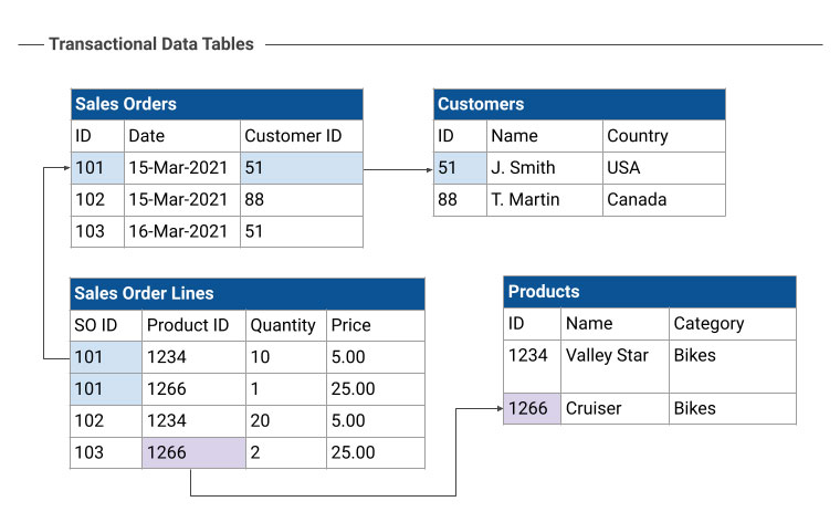
Figure 1: Transactional data tables in 3rd Normal Form
In figure 1, see how four related transactional data tables provide a complete picture of sales orders. (Note: This example is dramatically simplified for clarity.) Most any question about sales can be answered by combining the data in the tables in different ways.
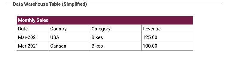
Figure 2: Data Warehouse Table
The data warehouse table shown in Figure 2 is how the data might be reshaped in a typical BI/Analytics project. The business person probably told a data engineer, “I’d like to see monthly revenue, broken out by country and product category.” The data engineer dutifully wrote code to pull together the data from the four detail tables to answer the question at hand.
What’s the problem? While we certainly get the answer we were looking for, what if we want to ask a different question, such as “What is our best selling product?” That is going to need a different transformation of the data. So, our business person sets up another meeting with the data engineer. Having to keep going back to an intermediary really impedes your ability to be agile.
Another problem with this approach is that there is no way for the business user to dig into those monthly revenue numbers to see the composition or to check for errors. By having the data tables in their original form, it is easy to drill into the details to find errors in the data, problems with the business, or just to explore new questions.
2. Explore the Data
With access to raw, detailed data in Incorta, you can take a more free-form iterative approach that prioritizes exploration and discovery, because the answers to one question naturally lead to other questions. You don’t know what you don’t know, and discovering something new and unexpected is what leads to business breakthroughs.
In Incorta, you acquire data as it appears in the source system, and business users can pull out pieces of that data as needed, without working through intermediaries.
“As-is” data will be organized into many tables, usually related (or joined) together. For example, a sales order record is typically joined to a customer record, a product record, a salesperson record and so on to build up a complete picture of the transaction. You’ll have the power and freedom to go anywhere with your data exploration and discovery.
As you explore, you will encounter two major categories of data, each of which serves a different analytical purpose:
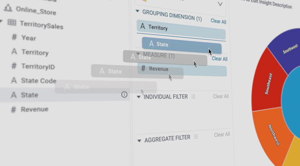
Measures — Sometimes called facts, measures are numerical values such as currency, quantities, and percentages that are combined with dimensions to arrive at reportable business metrics.
Dimensions — Sometimes called attributes, dimensions are used to segment the data into reporting groups, and represent various facets of the business such as product categories, sales territories, fiscal quarters, organizations, or transaction types. For example, you could group revenue by the month and region dimensions.
Try a few explorations, combining different measures and dimensions together to gain familiarity with the data.. As you work, review your results against the source system to be sure the numbers check out. Don’t wait for perfection. The important thing is to start now, iterate, discover, and grow from there as you become increasingly confident.
3. Decide What to Measure
Many times you don’t have a choice about what to measure. You are given KPIs (Key Performance Indicators) or OKRs (Objectives and Key Results) that your department is held accountable to. There may also be measurements that are dictated by your industry.
Domain experts may have more/better ideas of what to measure to ensure business success, based on their experience. Once you explore the data, you may find some measurement that everyone else has missed, but you think could generate important insights.
Analyzing data from outside your firm can also open up new avenues for insights. For example, many companies with interdependent business operations share data. You can evaluate not only your performance, but your performance in relation to that of your suppliers, vendors, and downstream customers, if appropriate.
Industry associations are another good source of metrics. For example, if your business involves a supply chain, the Association for Supply Chain Management publishes the SCOR model which includes over 250 standard metrics calculations. Consulting firms such as eCapital Advisors and analyst firms such as Gartner publish industry-specific metrics and benchmarks that you can analyze your performance against.
4. Analyze Your Data
There are many different tools and techniques for analyzing data that can lead to new discoveries.
Filtering and Sorting — This is a basic technique that you will turn to time and again. For example, suppose you are a salesperson looking through sales data, wondering whether your top customers represent your best upsell opportunities. You can apply filters to show only the data from those customers who spent more than $10,000 per month, in your territory, in the current year. Then you can sort this data by revenue amount and drill into their purchasing activity.
Aggregations — This involves computing a sum, count, or average for a particular measure sliced by one or more dimensions that are meaningful to you. For example, it might be useful for a retailer to know which product categories are the best sellers by region. Do men’s and women’s coats sell equally well in all regions? Are mountain bikes popular in only some states? A pivot table that puts dimensions along the sides and top of a table, and values in the intersecting cells, is very handy for viewing aggregated measures cut by two or more dimensions. A variation of the pivot table is the heatmap, which shows the hotspots in the table visually.
Trends — Most all transactions have dates, and different parts of the date (the year, month, quarter, day of the week, week of the year, etc.) can be used as a dimension for analysis. For example, what if we want to know the average sales order amount (a measure) by each month (a dimension)? Is it going up or down? Can we detect seasonality using a week-by-week analysis?
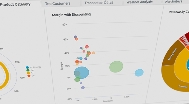
Correlations — A correlation analysis can help you quantify the relationship between two or more related variables, so you can understand how one measure might change as the other measures change. The basic way to create this kind of analysis is to plot one variable on the Y-axis, and the other on the X-axis.
Above all, don’t be afraid to experiment, as performing different types of analysis on new combinations of measures and dimensions, and dropping them into different graphs and charts is how you generate new insights.
5. Visualizing the Data
You might be familiar with bar charts and pie charts. But there are so many other kinds of visualizations that can help you tell a story with your data. Choosing the right data visualization style can both make it easier for you to interpret data, and then cause people to interpret your data in different ways.
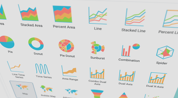
Showing the composition of many parts related to a whole is the classic use of a pie chart. But did you know that you can also have multi-level pie charts (sometimes referred to as pie-donut or sunburst charts) that can represent, for example, both categories and sub-category relationships in a single chart?
The bubble chart combines three different measures along with one dimension. The scatter chart is similar, but only plots two measures instead of three, and is also great at revealing correlations.
Data that trends over time is often best shown using line charts, while comparisons (for example, sales by category at a fixed point in time) are often best shown using bar or column charts.
The possibilities are almost endless, but the important thing to remember is that different kinds of charts can be used to support the story you want your data to convey. Again, you’ll want to experiment with visually presenting the data in different ways.
6. Publishing your Results
After gathering, analyzing and visualizing your data, the final step is to publish your work, either to gain support for your decisions, or to allow others to contribute to the analysis and reach their own conclusions.
Dashboards typically contain one or more charts, tables, maps, plots, gauges or key metrics. They group different data visualizations together into a form that people can easily browse. Dashboards are dynamic, interactive tools designed to maximize comprehension and facilitate agile decision-making.
The ordering and organization of the visuals are important. The layout can either be all on a single page, or across multiple tabbed pages. Tabs can break a larger data analysis apart into smaller pieces that can be sequenced to reveal a data story (sometimes this is called data storytelling.)
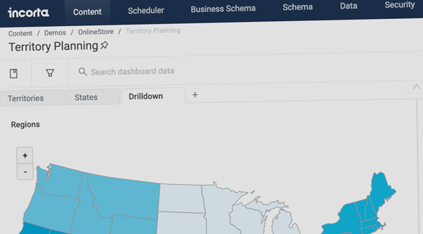
You want the flexibility to give users the ability to do their own filtering, and drilling down into the data. For example, you might give the dashboard to a group of regional managers — each manager is going to be interested in viewing the metrics for their region, and may want to drill into the details by salesperson, by customer, or by product category.
New tools for new times
Businesses today are looking for breakthroughs that will allow them to thrive during challenging times. That has pushed business users to take a bigger role in data analysis projects. Incorta provides the tools for line-of-business teams who want agility today, and room to grow tomorrow.
To learn more, download our eBook, Next Level Data Analytics.